Dulux 2023 Colour Forecast

Picture of REBECCA LLOYD-JONES

REBECCA LLOYD-JONES

Through Permit Pending and Site Intel, she analyses the forces shaping residential development in real time - from planning policy and interest rates through to construction costs, infrastructure pressure, feasibility and delivery risk - translating complex market signals into grounded, practical development intelligence.

Dulux 2023 Colour Forecast featuring three separate palettes designed to revive and inspire.

Share Post:

Image of indoor plant in pot in a frame with heading for article

Dulux Colour Forecast 2023

The Dulux Colour Forecast for 2023 comprises three emotive palettes inspired by our need to reconnect with nature, desire for balance and calm, as well as reviving our spirits with joy and play. You can pop over to the Dulux Australia website to see all of these colour palettes and the beautiful combinations there.

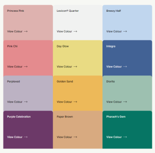
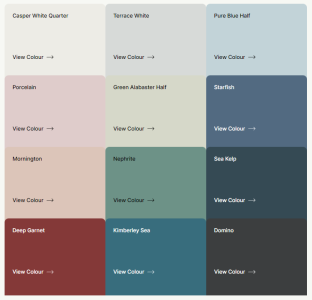
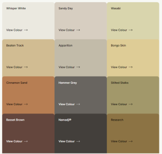
Revive mixes nostalgic elements in this joyful palette of eclectic brighter hues to encourage moments of pure escapism. Balance is a refined and reassuring palette of serene oceanic blues and weathered pastels that foster stillness and calm. Connect reflects a simpler lifestyle with warm earth-based colours that reinforce a connection with nature.

Revive: “Emerging from challenging times we revive our spirits through joy and creativity”
Balance: “Uncertainty creates a need to restore the balance in our lives”
Connect: “Our connections are renewed through sustainability, authenticity and meaning”

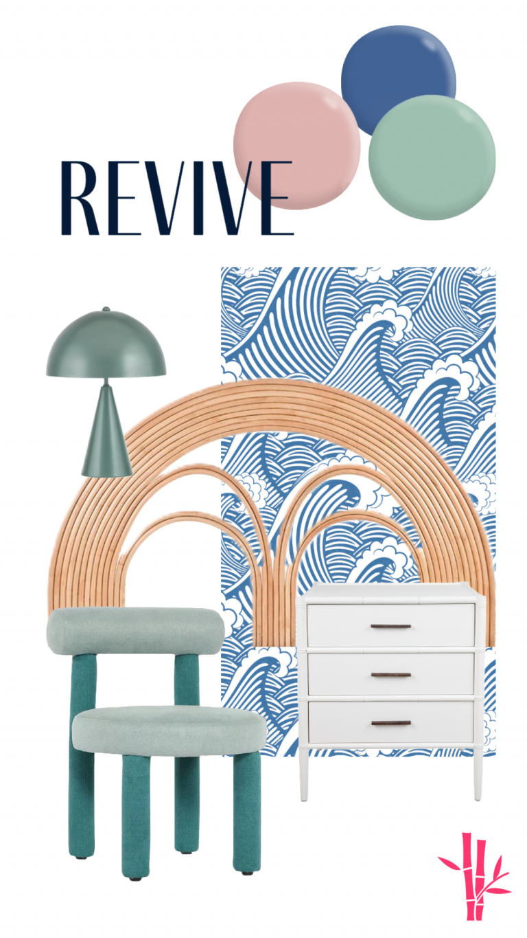
Revive

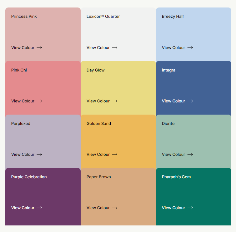
The Revive palette is creative and joyful, featuring soft blue and lilac used alongside vibrant emerald green, warm yellow and accents of playful pink and purple. With a need to feel secure and emplowered we unlease our creativity and set ourselves free from regulations.

Moodboard goodies from The Family Love Tree, La Maison and Olive et Oriel. If you’re interested in any of these beautiful creations, get in touch.

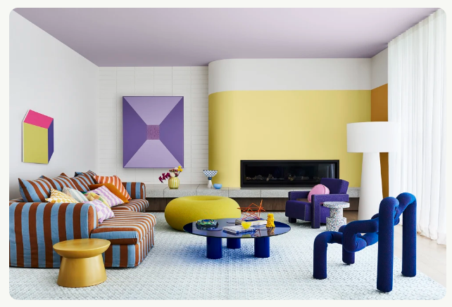
Vibrant and joyful with softer colours such as Breezy Half and Perplexed bring life to a room and emerging colours such as Diorite and Pharaoh’s Gem add a freshness to the palette while warmth is added with Paper Brown, Golden Sand and Day Glow. The palette works well with Lexicon® Quarter, a cool fresh white perfect for modern, open-plan spaces. Colours featured: Lexicon® Quarter, Perplexed, Day Glow and Golden Sand.

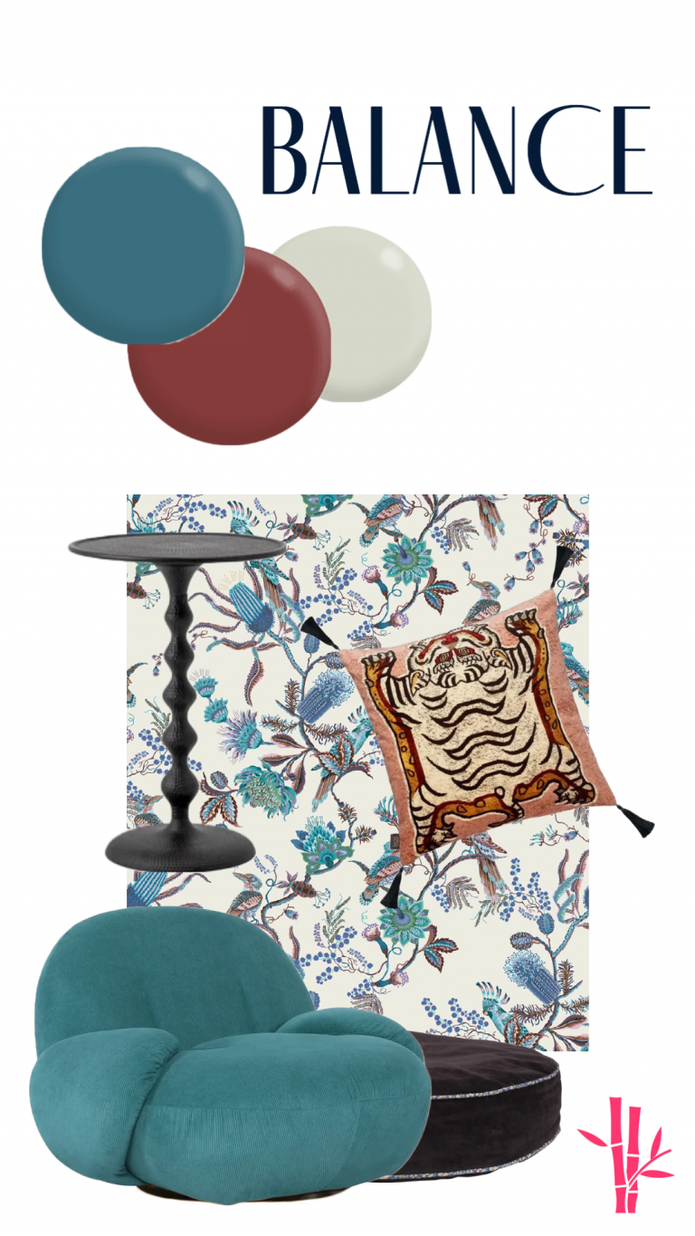
Balance

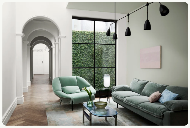
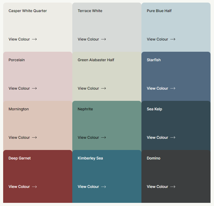
The Balance palette features delicate pastels, oceanic hues such as soft greens, and deep moody teals and blues, punctuated with accents of deep garnet and near-black. Colours featured: Dulux Pure Blue Half and Kimberley Sea.

With so much uncertainty and loss of control, there is a need to restore the balance and a sense of calm in our lives. In a post-pandemic world, some of us are needing the reassurance of rules and parameters. Beauty that is underpinned by structure reassures us. The allure of the ocean and its untapped potential draws us in and allows its calming effect to wash over us. 

Elegant and refined, the harmonious lines of waves and the movement of the sea inspire colour and pattern in our interiors.

Moodboard goodies from The Family Love Tree, Sage x Clare and Milton & King. If you’re interested in any of these beautiful creations, get in touch.

Connect

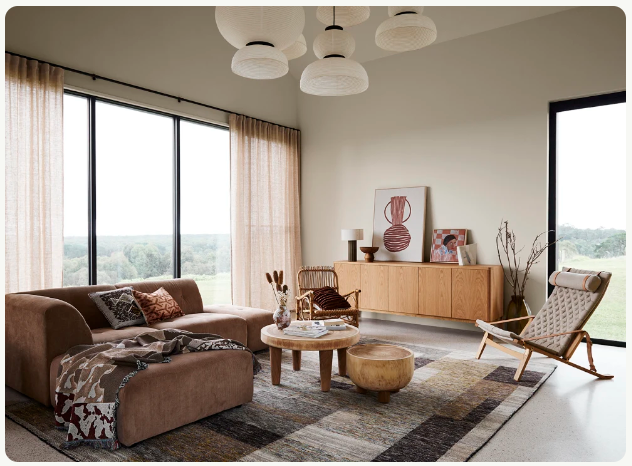
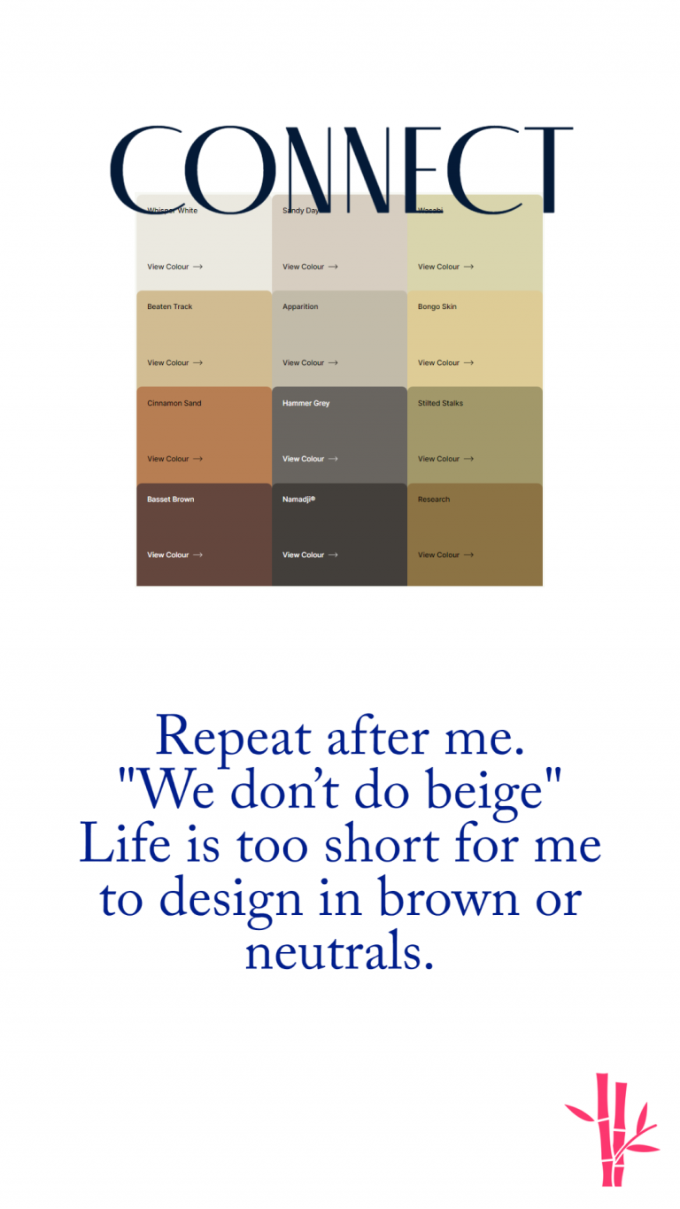
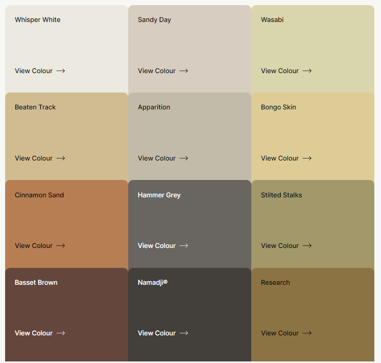
The Connect palette features soft earthy neutrals, naturals, muted greens, and wheat yellows, combined with accents of warm deep brown, grey and charcoal. Colour featured: Dulux Sandy Day

My purpose on this earth is not to rain on anybody’s parade but I don’t do brown, beige or bleh colours. I don’t talk about them or give them publicity. You can read below if you wish…

A home with a connection to the outdoors has become vital to our wellbeing. Technology has provided us with a new freedom; we no longer need to live in the cities and the suburbs to work – allowing the move to rural settings where we can reconnect with nature. We look for sustainability, authenticity and meaning in the items we choose to connect to and surround ourselves with at home.

Decor has a raw beauty featuring imperfections to honour the process of making.

I hope you’ve enjoyed what Dulux has to offer you for the coming year. I’m planning on some beautiful interiors utilising the Revive palette and some bedrooms and more relaxed spaces using the Balance palette. I may use one or two colours from Connect, but don’t bet on it.

A new colour on your walls is the most cost effective and quickest way to update the feeling and look of a room, so why not get in touch and we can find the most inspirational colours for you and create a beautiful colour scheme or room design from them. Just click on the button below and we can discuss how to create something amazing to update your home.

Bec x

Strategic development management for developers, builders and housing providers. Helping projects move from concept to construction with greater clarity and confidence.

Practical commentary on planning, feasibility, delivery and market conditions.

No spam. Just strategic updates, commentary on planning, feasibility, delivery and market conditions.